Apps and Installations
Have a question about a Dropbox app or installation? Reach out to the Dropbox Community and get solutions, help, and advice from members.
- Dropbox Community
- :
- Ask the Community
- :
- Apps and Installations
- :
- Re: Bring back the green 'synced' checkmark in the...
- Subscribe to RSS Feed
- Mark Topic as New
- Mark Topic as Read
- Float this Topic for Current User
- Bookmark
- Subscribe
- Mute
- Printer Friendly Page
Re: Bring back the green 'synced' checkmark in the system tray. Dropbox now looks offline all the ti
- Labels:
-
Desktop
Bring back the green 'synced' checkmark in the system tray.
- Mark as New
- Bookmark
- Subscribe
- Mute
- Subscribe to RSS Feed
- Permalink
- Report Inappropriate Content
In my Windows system tray (next to the clock), Dropbox used to show that it was fully synced by showing a green check-mark over the Dropbox icon. This was really helpfull.
If Dropbox was offline, it would show no overlay icon.
Recently (and according to Dropbox itsself) this has changed, the Dropbox icon now shows no overlay if it is fully synced, but to me, i constantly think my Dropbox is offline, instead of 'fully synced'.
So the idea is: please bring back the green 'fully synced' checkmark. Or -at least- make it an option to show it.
Please upvote this idea if you agree ![]()
- Labels:
-
Desktop
- 501 Likes
- 334 Replies
- 120K Views
- wowtah
- /t5/Apps-and-Installations/Bring-back-the-green-synced-checkmark-in-the-system-tray/td-p/246363
- Mark as New
- Bookmark
- Subscribe
- Mute
- Subscribe to RSS Feed
- Permalink
- Report Inappropriate Content
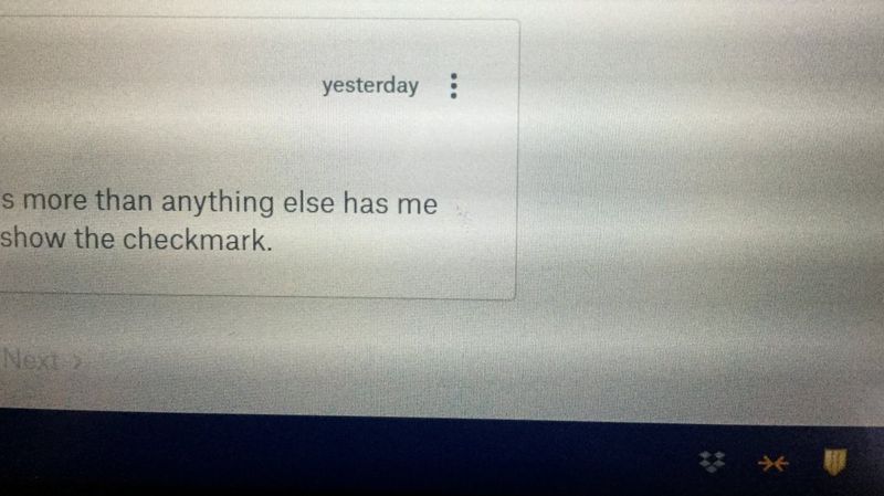
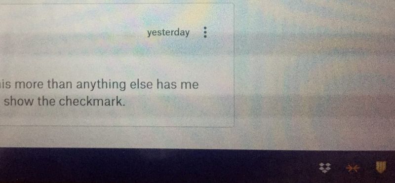
I'm a paid customer. It's stupid for the Dropbox team to remove the green checkmark. It's even more stupid for them to ask for two screenshots to compare. It's not about how the screen DISPLAYS it, it's about how our eyes SEE it. Please take into the consideration the brightness/glare/reflection of the screen, the lighting condition of the environment and the eyesight of the user! I just took two photos of my screen, both set at the same brightness (set at "darker" which is what I usually use at night), which better approximate how we see than the screenshots. It's almost like an eye test to me.
Offline:

Online:

- Mark as New
- Bookmark
- Subscribe
- Mute
- Subscribe to RSS Feed
- Permalink
- Report Inappropriate Content
I don't know why my previous comment disappeared (I don't want to believe that it got deleted deliberately) and I have no way to recover it. I am not going to let it go so I am repeating it here. (Just in case, I am going to back this up.)
I am a paid user. It's stupid for the Dropbox team to remove the green checkmark. It's even more stupid for them to ask for screenshots for comparison. It's not about how the screen displays it. It's about how our eyes see it. Please take into consideration the brightness/size/reflection/glare of the screen, the lighting condition of the environment and the eyesight of the user. I just took two photos of my screen, taken at the same brightness (set at "darker" which I use at night), which better approximate how we see than the screenshots. It's almost like an eye test to me. It kills my eyes, literally!
Offline:
Online:
[Added later: I don't know why, my previous comment reappears (I am sure it disappeared). So it's now a duplicate. I couldn't find a way to delete it but if you do, feel free to do so. ]
- Mark as New
- Bookmark
- Subscribe
- Mute
- Subscribe to RSS Feed
- Permalink
- Report Inappropriate Content
@KK K. and to Dropbox
My last comment also "strangely" disapperead... So like KK K. I want to repeat it here :
I have unlimited access to Microsoft One Drive with my MS Office subscription, I have access to Google Drive with my Google account, I have access to other cloud storages (Acronis, etc.) but, so far, I have been preferring Dropbox because I considered it was working better than all the above. Mainly I had a feeling of safety! This feel is now completele vanishing because of this incongruous change. Please bring back the green checkmark or a suitable (i.e. visible, clear, obvious) substitude.
Unfortunatly, as I have read somewhere else in this foum, I fear that whosoever has conceived this change is so full of his own ego and vainness that I don't expect to see a one-eighty.
Moreover, when the rage will soon fadeout we, all users, will be stuck with a done deal...
This situation is so ridiculous and so sad that I want to cry...
- Mark as New
- Bookmark
- Subscribe
- Mute
- Subscribe to RSS Feed
- Permalink
- Report Inappropriate Content
I was wondering... Maybe another top tier player on the market (lets say... Google!) make a change on its UI in order to provide a green checkmark, since Dropbox has gave up on this... and maybe GDrive seems to be seeing as the best option on market ![]()
- Mark as New
- Bookmark
- Subscribe
- Mute
- Subscribe to RSS Feed
- Permalink
- Report Inappropriate Content
It's about 3 weeks since I made this post. And, at this point in time, I am still not used to the removal of the green checkmark. Dropbox still seems offline to me, or at least it still looks 'wrong', and definetely not 'up to date'.
What do you all think? Have you gotten used to the change yet?
- Mark as New
- Bookmark
- Subscribe
- Mute
- Subscribe to RSS Feed
- Permalink
- Report Inappropriate Content
I haven't got used to it and I never will. It looks permanently offline to me.
I want my green tick back!
- Mark as New
- Bookmark
- Subscribe
- Mute
- Subscribe to RSS Feed
- Permalink
- Report Inappropriate Content
In reply to wowtah:
What do you all think? Have you gotten used to the change yet?
--
No..!! I still think my network is down every time I look at it.
For the most part, I use Fedora Linux, and the taskbar on my system is dark grey. The Dropbox icon is barely visible at the best of times with my eyesight, the removal of the green tick is corporate stupidity at its ultimate. As I said in my previous post, I have worked for more than one multinational company and I have seen stupidity descending from the boardroom on many occasions, but this takes the biscuit.
I want my green tick back..!!!
- Mark as New
- Bookmark
- Subscribe
- Mute
- Subscribe to RSS Feed
- Permalink
- Report Inappropriate Content
Want the green tick back?
Go to "administration" and under "services" you deactivate the two dropbox-update services.
Then you install an older version off Dropbox.
And also remember to delete the file "dropboxupdate.exe" in
C:/program files/dropbox/update
- Mark as New
- Bookmark
- Subscribe
- Mute
- Subscribe to RSS Feed
- Permalink
- Report Inappropriate Content
I couldn't agree more with the majority of comments: BRING BACK THE GREEN CHECKMARK!!!!
or at the very least, change the color of the 'synced' icon from solid black-on-white/white-on-black to blue-on-white/black (with overlays as appropriate) and make the 'offline' icon gray-on-black/white. It is way to difficult to distinquish current the online vs offline color scheme.
Flat UI MUST DIE!!!!
- Mark as New
- Bookmark
- Subscribe
- Mute
- Subscribe to RSS Feed
- Permalink
- Report Inappropriate Content
Got this reply today. Seems like they've made up their mind...
"The rationale behind the icons change is among other reasons to also provide a more consistent experience between users of different operating systems. In any case, please note that it is not possible to revert to the previous system tray green checkmark icon."
Hi there!
If you need more help you can view your support options (expected response time for a ticket is 24 hours), or contact us on X or Facebook.
For more info on available support options for your Dropbox plan, see this article.
If you found the answer to your question in this Community thread, please 'like' the post to say thanks and to let us know it was useful!

